Comparing Video Game Age Rating Logo Colours From Around the World
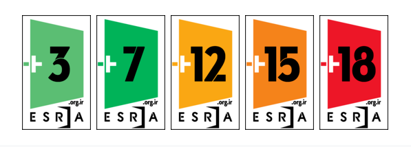
Of the countries that use colours in their video game age rating logos, most use a general stoplight pattern of green for everyone, yellow and orange for older children/teens, and red for adults.
These are the countries/regions that follow that pattern perfectly:
Europe

Iran

Mexico

New Zealand

Saudi Arabia

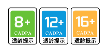
Many countries also add blue, which near universally comes right after green, and then follows the yellow then red
China

Indonesia

South Korea

Taiwan

Brazil and Russia follow this pattern but add black for 18
Brazil

Russia (also throws white for 0 at the front, just like Germany below)

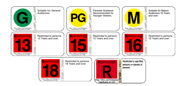
Finally, we have the countries that do not follow the stoplight order
Germany keeps the blue after green and ending with red pattern, but begins with white and yellow

Australia is the only one to not immediately follow green with blue, and instead places yellow in between. It does keep the red and black pattern for the last two age ratings

And finally, the UAE somewhat confusingly goes from light yellow to green to dark yellow, and then follows the orange, red pattern. Also it has the highest number of any age board with a 21(The rest cap out at 18)

All information and images sourced from https://en.wikipedia.org/wiki/Video_game_content_rating_system. I hope you found this as interesting as I did!
If you would like to use my lists for any reason (make a video, add it to a wiki, build on it and make your own list, anything at all), you are free to do so! No need to credit if you don’t want. I would be so happy if you want to be a link to sharing silly gaming knowledge to even more people. All I ask is that if you make anything, please share it with me because I would love to see 🙂
Please note I don’t own the images anyhow, they’re all from eBay or Mercari unless otherwise cited
Thanks for witnessing!


